Snippset Feed
GitHub Copilot becomes much more effective when it is customized for your project. Rather than relying on one-off prompts, you can combine several reusable building blocks that provide context, standardize outputs, automate repetitive work, and create focused AI interactions.
A well-organized customization strategy typically includes the building blocks:
- Instructions: Define project-wide coding standards, architecture, documentation, and development guidelines.
- Custom Instructions: Add folder- or task-specific rules that extend the general instructions for a particular part of the repository.
- Templates: Provide reusable file structures with placeholders for creating consistent documents and source files.
- Prompts: Automate repetitive, multi-step workflows such as creating new features, documentation, or assignments.
- Chat Modes: Create specialized AI conversations for brainstorming, planning, reviews, or other focused tasks.
How They Work Together
A typical workflow might look like this:
- Instructions provide the overall project context.
- Custom Instructions add rules for a specific area of the repository.
- Templates define the structure of the files to generate.
- Prompts execute the workflow and create or update the required files.
- Chat Modes support focused discussions before or during implementation.
Using these building blocks together makes Copilot more predictable, produces more consistent results, and reduces the need to repeatedly explain your project's standards and workflows.
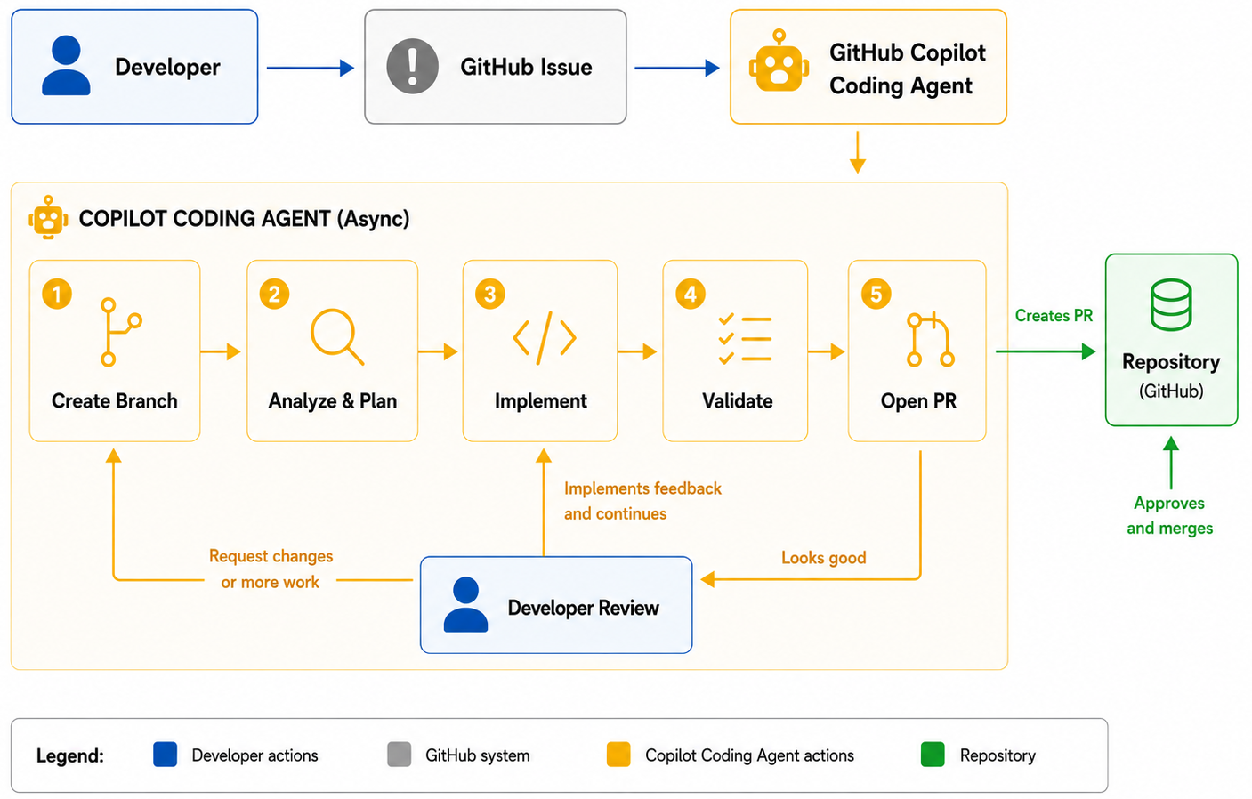
Instead of helping you one prompt at a time, GitHub Copilot Coding Agent works like an autonomous developer. You assign it a GitHub issue, and it independently implements the requested changes while you continue working on other tasks.
How does it work?
- Assign a GitHub issue to Copilot.
- The Coding Agent creates its own branch and starts a secure GitHub Actions environment.
- It analyzes the repository, writes the required code, runs tests and validation, and commits its progress.
- When finished, it opens a draft pull request containing the proposed solution, implementation details, and a summary of the changes.
- You review the code, provide feedback if needed, and decide whether to merge the pull request.
What can it do?
The Coding Agent is well suited for:
- Implementing new features
- Fixing bugs
- Refactoring existing code
- Adding or updating tests
- Improving documentation
- Performing routine maintenance tasks
Why use it?
Unlike Agent Mode, which works interactively inside your IDE, the Coding Agent runs asynchronously on GitHub. It can continue working in the background while you focus on other development tasks. Because every change is delivered through a standard pull request, your existing review process, branch protections, and approval workflow remain unchanged. When combined with Model Context Protocol (MCP), the Coding Agent can also use project-specific tools and external data sources to produce more accurate, context-aware solutions.
GitHub Copilot can do more than answer general questions. With custom chat modes, you can create specialized AI experiences that guide conversations toward a specific goal. Rather than relying on a generic assistant, a chat mode defines how Copilot should respond, what tools it may use, and which rules it should follow. This makes conversations more consistent and helps the AI stay focused on the task at hand.
Chat modes are ideal for activities such as brainstorming new features, reviewing architecture, planning documentation, or coaching developers. Instead of repeatedly explaining how you want Copilot to behave, you define the behavior once and reuse it whenever needed.
How to create a custom chat mode
- Create a
.github/chatmodesdirectory if it does not already exist. - Add a new file ending with
.chatmode.md. - Define the chat mode's metadata, including its description and available tools.
- Describe the response structure you expect Copilot to follow.
- Add clear rules that limit the scope and style of the conversation.
- Save the file and select the chat mode from the Copilot Chat interface.
Example
---
description: Brainstorm ideas for new learning assignments
tools:
  - codebase
---

# Response Format

For every response:

1. Summarize the current project or codebase.
2. Suggest 3–5 new ideas.
3. Explain why each idea is valuable.
4. End with one follow-up question.

# Rules

- Keep responses concise.
- Focus on ideas, not implementation details.
- Build on existing project content.
- Always finish with a question.
Once the chat mode is available, every conversation follows the same structure and objectives. This produces more predictable responses and reduces the need to rewrite prompts for recurring activities.
Best practices
- Create one chat mode for each recurring role or workflow.
- Define a clear response format with consistent sections.
- Limit the scope so Copilot stays focused.
- Keep rules short and unambiguous.
- Combine chat modes with instruction files, templates, and reusable prompts for an even more consistent AI-assisted workflow.
Templates are a simple way to standardize files that are created repeatedly. Instead of asking GitHub Copilot to generate content from scratch each time, you provide a predefined file containing the desired structure, headings, placeholders, and optional example content. Copilot can then use this template as the starting point, ensuring that every generated file follows the same layout and includes all required sections.
Templates are especially useful for documentation, assignments, design documents, issue reports, meeting notes, tutorials, and many other project artifacts. By combining templates with reusable prompts and instruction files, you can automate repetitive workflows while maintaining consistent quality across your repository.
How to create a template
- Create a folder to store reusable templates (for example,
templates). - Create a Markdown file that contains the standard structure.
- Replace project-specific content with placeholders.
- Reference the template from a reusable prompt so Copilot knows when to use it.
- Update the template whenever your standard format changes.
Example
# assignment-template.md

# {{Assignment Title}}

## Learning Objectives

- Objective 1
- Objective 2

## Prerequisites

- Requirement 1

## Instructions

1. Step one
2. Step two

## Starter Code

```python
# Add your solution here
Summary
Briefly describe what the learner should have accomplished.
A reusable prompt can then instruct Copilot to copy this template, replace the placeholders with the user's input, generate any optional starter code, and update related project files automatically.
Best practices
- Keep templates focused on structure rather than detailed content.
- Use clear placeholders that are easy to identify and replace.
- Create separate templates for different document types.
- Review templates regularly to keep them aligned with current project standards.
- Let prompts perform the customization while templates provide the consistent foundation.
Many AI coding assistants only know what is included in your prompt or current file. Model Context Protocol (MCP) extends GitHub Copilot by giving it secure access to external tools and project-specific information, making its responses far more relevant and accurate.
What is MCP?
MCP is an open standard that connects AI assistants with repositories, documentation, APIs, databases, issue trackers, CI/CD systems, and other development tools. Instead of manually copying information into a prompt, Copilot can retrieve the context it needs automatically.
How does it work?
- An MCP server exposes tools and data through a standard interface.
- GitHub Copilot discovers these tools and can call them when needed.
- The retrieved information is added to the AI's context before generating a response.
- Developers remain in control and can review or approve actions before they are executed.
What can Copilot do with MCP?
With the appropriate MCP servers, Copilot can:
- Read GitHub issues and pull requests
- Search documentation and codebases
- Query external APIs or internal knowledge bases
- Access CI/CD logs and monitoring data
- Integrate with tools such as Slack, Figma, or custom business systems
By combining MCP with Agent Mode or the Coding Agent, GitHub Copilot becomes a context-aware development partner that can understand your project, use external tools, and automate complex development workflows while keeping developers in control.
Many development activities involve repeating the same sequence of actions. Prompt files allow you to package those steps into reusable workflows that can be launched directly from Copilot Chat.
Instead of writing a long prompt every time, you simply execute the reusable prompt and let Copilot perform the workflow.
What prompt files can do
A reusable prompt can:
- Ask for missing information
- Create folders
- Generate multiple files
- Apply templates
- Update configuration files
- Reference instruction files
How to create a reusable prompt
- Create a
.github/promptsfolder. - Create a file ending with
.prompt.md. - Describe the workflow as numbered steps.
- Reference templates or instruction files when appropriate.
- Save the file.
Example
# .github/prompts/new-assignment.prompt.md

Create a new assignment.

1. Ask for the assignment topic if none is provided.
2. Create a new folder in `/assignments`.
3. Generate `assignment.md`.
4. Add starter code if required.
5. Update `config.json`.
6. Verify that all generated files are linked correctly.
You can then invoke it from Copilot Chat using:
/new-assignmentIf the required information is missing, Copilot asks follow-up questions before completing the remaining steps.
Best practices
- Design prompts around complete workflows.
- Break complex tasks into numbered steps.
- Reference instruction files instead of repeating guidance.
- Keep prompts reusable rather than project-specific.
- Test prompts regularly as your project evolves.
Different folders often require different types of guidance. Documentation, tests, templates, and source code rarely follow identical rules. Custom instruction files allow you to define folder-specific behavior so Copilot adapts automatically depending on where you are working.
When to use custom instructions
Examples include:
- Documentation folders
- Assignment content
- Test projects
- Infrastructure scripts
- Sample applications
How to create custom instructions
- Create an instruction file in the appropriate location.
- Describe the expected structure and formatting.
- Specify any required sections.
- Define optional content such as starter code or examples.
Example
# assignments.instructions.md

When creating a new assignment:

- Start with a title.
- Add learning objectives.
- Include prerequisites.
- Add step-by-step instructions.
- Finish with review questions.
- Provide starter code when applicable.
Whenever Copilot generates content for assignments, it can follow these requirements automatically.
Best practices
- Keep each instruction focused on one purpose.
- Store instructions close to the content they describe.
- Update them whenever the folder structure changes.
- Avoid duplicating global project rules.
GitHub Copilot has evolved from an AI code completion tool into a comprehensive development assistant. Today it supports the entire software development lifecycle, helping developers write code, review changes, automate tasks, and rapidly prototype new ideas.
Writing Code
- Code Completion (2021) – Provides inline AI code suggestions while you type. Best for: Faster coding and reducing repetitive work.
- Copilot Chat (2023) – Answers coding questions, explains code, generates tests, and assists with debugging. Best for: Learning and problem solving.
- Copilot Edits (2024) – Applies coordinated changes across multiple files from a single prompt. Best for: Refactoring and implementing features.
Code Quality
- Code Review (2024) – Detects bugs, performance issues, and improvement opportunities. Best for: Improving code before human review.
- Pull Request Summaries (2024) – Automatically creates clear summaries of code changes. Best for: Better collaboration and documentation.
AI Agents
- Agent Mode (2025) – Plans, edits, tests, and iterates directly within your IDE. Best for: Interactive, multi-step development tasks.
- Coding Agent (2025) – Works asynchronously on GitHub by completing issues and opening pull requests. Best for: Automating routine development work.
Advanced AI
- Multi-Model Support (2024) – Lets you switch between different AI models to suit each task.
- Model Context Protocol (MCP) (2024) – Connects Copilot to repositories, documentation, APIs, and external tools, enabling richer context and more accurate AI assistance.
- GitHub Spark (2025) – Generates interactive application prototypes from natural-language prompts. Best for: Quickly validating ideas and creating proof-of-concepts.
Together, these capabilities transform GitHub Copilot from a coding assistant into an AI-powered development platform that helps developers build software faster, with greater confidence and less repetitive work.
AI-generated code is most valuable when it follows your project's conventions. Instead of repeating coding rules in every prompt, you can store them in an instruction file. GitHub Copilot automatically uses these instructions when generating code, helping produce more consistent results across the repository.
What instruction files are
Instruction files define general project guidance, such as:
- Coding style
- Naming conventions
- Architecture preferences
- Testing requirements
- Documentation standards
Unlike prompts, instruction files do not perform actions. They simply provide persistent context for Copilot.
How to create an instruction file
- Create a
.github/instructionsfolder if it does not already exist. - Create a Markdown instruction file.
- Add the development rules you want Copilot to follow.
- Commit the file with your repository so the whole team benefits.
Example
# .github/instructions/coding.instructions.md

## Coding Standards

- Use C# 13 features where appropriate.
- Prefer dependency injection.
- Write XML documentation for public APIs.
- Use async/await for I/O operations.
- Add unit tests for new functionality.
Once saved, Copilot can use these guidelines whenever it generates code for your project.
Best practices
- Keep instructions concise.
- Separate unrelated topics into multiple files.
- Review them as your project evolves.
- Avoid conflicting rules.
There is no universal platform that fits every AI project. The best solution depends on your technical capabilities, business goals, existing systems, budget, and long-term strategy. In many cases, organizations combine multiple approaches—for example, using cloud services together with open-source frameworks or integrating AI into existing enterprise platforms.
Before selecting a technology, it is worth evaluating not only today's requirements but also how the solution will evolve over time.
Questions to ask
- What business problem should the AI agent solve?
- How much customization is required?
- What technical expertise does the team have?
- Which systems need to be integrated?
- What security and compliance requirements exist?
- How important are speed and long-term maintenance?
Quick comparison
| If your priority is... | Consider... |
|---|---|
| Maximum flexibility | Custom development |
| Fast deployment | Low-code platforms |
| Existing business systems | Enterprise platforms |
| Scalability and managed services | Cloud platforms |
| Advanced customization | Open-source frameworks |
A practical recommendation
Many successful AI solutions combine multiple technologies. For example:
- Use Azure OpenAI, AWS Bedrock, or Vertex AI to access AI models.
- Build business logic with LangGraph, Semantic Kernel, or AutoGen.
- Connect workflows using Power Automate, n8n, or Zapier.
- Integrate with existing enterprise platforms such as Salesforce, SAP, or ServiceNow when business data and workflows already exist.
This layered approach lets you benefit from the strengths of each technology instead of relying on a single platform.
Summary
Choose the platform that best fits your business goals, available skills, and existing technology landscape. The most successful AI projects focus on solving business problems—not on using a particular tool.
- .NET
- Agile
- AI
- ASP.NET Core
- Azure
- C#
- Cloud Computing
- CSS
- EF Core
- HTML
- JavaScript
- Microsoft Entra
- PowerShell
- Quotes
- React
- Security
- Software Development
- SQL
- Technology
- Testing
- Visual Studio
- Windows